Visualizer
Exploring your attack surface through the interactive 2D and 3D graph visualizer
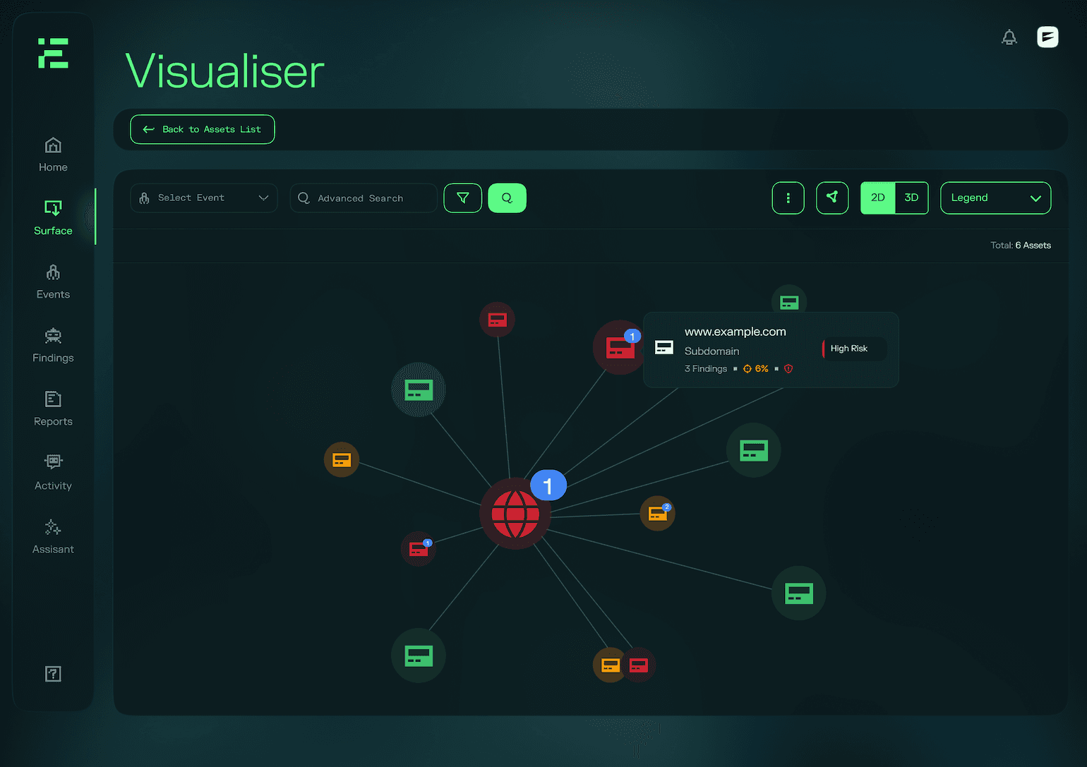
The Visualizer is an interactive graph of your attack surface, showing the relationships between your domains, assets, and beacons. Where the Assets list gives you a filterable inventory, the Visualizer gives you a structural view, useful for understanding how assets connect to each other and for spotting clusters of exposure that share a common origin.
Key Features
Interactive 2D and 3D Mapping
The Visualizer supports both 2D and 3D graph layouts. You can switch between them at any time and navigate using pan, rotate, and zoom controls.
Asset Relationships
The graph maps the connections between your domains, subdomains, IP addresses, and internal networks. Relationships are drawn automatically based on how assets were discovered, giving you a view of which domains assets belong to and how your surface is structured.
Risk Levels
Each asset is colour-coded by its current risk level, so high-exposure areas stand out immediately. Clicking an asset opens its detail view, where you can see its findings, services, and technologies.
Filtering
You can filter the graph by test or by asset properties to focus on a specific subset of your surface. The graph updates as you apply filters.
Exporting
Use the export option to download an image of the current graph view, for use in reports or internal documentation.